
 |
 |
 |
 |
 |
 |
 |
 |
 |
Note
to readers: Portions of the following notes were originally written in outline
format. These portions have been editorially revised into sentences when
needed. The illustrations are close approximations of those made by Mr.
D’Arista. This material is not complete, with some small (and possibly large)
portions of lectures and some of the class assignments missing from the
original student notes. Notes copyrighted 1981/2004 by Judith Laue. This
material is freely available for nonprofit use. Please send email to
laue@erols.com to report typographical or other errors.
Student
Notes from “Special Studies in Painting: Composition”
A Studio/Lecture Course Taught by Robert D’Arista
Spring 1981, The American University
 Lecture
The root-2 rectangle (start with a square, draw the diagonal, then
drop the diagonal to the baseline) gives greater strength and force to the
internal structure of the painting. It creates and aligns forces within the
painting. Angled shape restriction might give more power and assertions of
forces. The right angle, L: vertical against horizontal, gives optimal
assertion of forces.
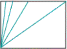
Consider
the possibility of regulating and even measuring this opposition. You relate
angles the way you would sizes, for example; here the direction is halved.
 Simple
angled relationship.
 Bisecting still gives systematic relationship
between angles.
Seurat used a simple compass-like machine.
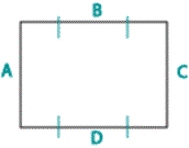
Inner square: Short length
(A) along the long length (D) of the rectangle forms each individual
rectangle’s inner square. Be very aware of the anatomy of the rectangle, but
don’t plan it out like a surveyor. Develop the painting. Have some shapes point
to the points of relationship on the horizontal and vertical framework.
The head is a series of thrusts within the canvas; not a circle.
Delacroix – very systematic. Fold a piece of paper and find the systematic
relationships upon the unfolding.
Begin the painting with a sketch, giving cognizance of the
rectangle relationships. Pathways can unite the canvas when objects are
scattered. Pathways direct the eye to the four corners and to where you want
the eye to go. Above and beyond anything else, make sure you can do that!
Whither the edge (of the line) goes, the eye goes.
There are certain priorities: Getting the eye around the
rectangle. Jumps: in music, there must not be unrelated jumps; rather, there
must be a subsequential movement. The lattice, rectangular relationships,
functions to make paths for the eye. This de Kooning figure is pinned to a
latticework of roads.
Portrait
Principles: Let lines go through the head respective of
the dimensions of the rectangle. This puts a series of tensions through it that
stops the endless circling that can happen with the head. Do this even with grapes.
Pythagoras
 = Root-2 Rectangle
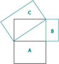
A
= Long side of original rectangle squared
B=
Short side of original rectangle squared
A
+ B = C
A2
+ B2 = C2
The
square of the hypotenuse of an angle equals the sum of the square of the other
two sides. But this isn’t mathematics. It is really primitive thinking. It is
savage.
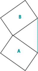 A=B
A=B
We
are intrigued by systematic relationships. Claude Levi-Strauss The Savage Mind. This is the very beginning of relationships. The primitive
mind is the human mind.
 Learn this elementary, childish trick of
expanding the rectangle. This keeps the relationship constant when enlarging or
decreasing the picture. This is why one must sketch first.
In
a square there is no inner square. I never work with a square canvas.
 = Distribution of the rectangle.
A
and B are equal, but no one would ever guess it. This makes the mind jump –
intriguing.
The
head is not static, but part of the whole thing. The head should not be a
static round thing that your eye can’t get out of. Instead of softening lines,
bring dynamic lines through to create dynamic tensions.
It’s
not indifference – we see the tensions, but we don’t exploit what we see. The
diagrams do not restrict expression. Even though poetry has rhymes, it does not
hinder what is being said, but gives speech the beauty of metered sounds.
Passion. The constrictions on language enhance the expression.
Geometrics
![]()
1.618 harmonic ratios.
The
Golden Section. Fibonacci series – pinecones,
rabbits. Rabbits: two rabbits are in a
cage. With a little luck, another will appear. The little rabbit will grow to
be quite incestuous, and now we have 5 rabbits. Soon we’ll have 8, 13. This is
the way of the world, you might as well understand it. It is the same with
pinecones. The product of the sum of the two previous sums. The dynamic
mechanism is always the same.
 All
are different, but all are the same. Sameness can be seen as being
multifaceted.
Philip
Guston said, “A painting is a thing.” It has an anatomy.

A
and B have the same weight, with different configurations.
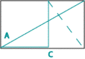
The
dotted diagonal is at a right angle to A, then bring down line C.

Identical
proportions to a series of identical relationships.
Compelling.
The simplest possible relationships.
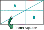
A and B have equal proportions.
Musical
scale is based on the same system of relationships.
Implications
of using the above diagram: Big jumps
and tiny jumps become possible, because you can relate them. Architectural
jumps – you can move up and down through the scale in an exciting way, without
losing the sense of relationship. Illiterate modern painters talk about shape
relationship. The painting itself is the most important shape.
Golden Section
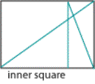
1.6 Bisect a box, make a diagonal.
Bring the diagonal down, and get the golden section. Then, find the inner
square bisecting line.
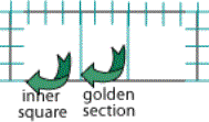
1.6
(golden mean?) x 4 (side of rectangle) = 6.4
Because
it is so simple, complexity is possible.
Lecture
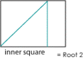
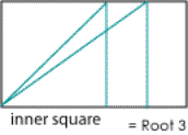
Make
a square, take the diagonal down to a root 2. And another down to a root 3.

New
idea = The spiral. Being controlled by an increment of growth. The way things
grow. Geometric progression away from an axis. Snails.

Generate
forms on the spiral and small mirrored rectangles form.
If
the rectangle is too even, this won’t work.
If
you choose not to use formal composition, still understand what it is. You are
intuitively doing it anyway. Hemingway does not get lost in long descriptions
of armor, as does the Odyssey. But both
his epic and Homer’s are grounded in particulars – that is, warfare and fishing
– and both transcend those particulars to arrive at their subjects. The Old Man and the Sea is about
endurance. The Odyssey is about the
wrath of Achilles
In
review: the eye moves along paths. Angles generate relationships and compositions.
We have to make relationships that move through the entire length and width of
the whole painting.
Frontality
 Diagrams
reflecting concern of opposition of forces (tensions). The purest form is the
vertical against the horizontal. Why is it that only the vertical and the
horizontal, as with Mondrian? Why not the diagonal? Because it is clear that
when painting is like this (see illustration), we assign greater stability to
the painting.
We
assign a certain stability to the horizon. Lay down a ground plane, a stable
earth that can support things.
The
early artist fights with perspective to lend a certain stability to the
painting. The grid gives this stability without distorting. So the artist feels
freer to come in at an angle, to have your cake and eat it too.
However,
at the same time, this horizontal may foil the sense of gravity. We play with
associations that we and the audience make. If associations are real and
universal, then we must take them into account. Blue: sky, space, foreverness.
Subtleties
taken into account can give a complicated series of stylized movements, each of
which can mean something (Seurat, Kandinsky). Instead of using obvious motions,
construct a series of subtle ones. At the heart of such a view, you get Kandinsky
saying, “This is energy” (head going up). Reduce and formalize the cues. The
diagram can work with this. Yin Yang, etc.
Diagrams
make a series of signs more easily understandable. You might think formalizing
constricts and inhibits, but it is the opposite. It makes the deviations from
the norm more understandable.
Likeness
or strong associations? When is it
necessary to give up likeness for association? This is the difference been
prose and poetry.
Frontality
of Painting: Frontality as opposed to
space. Frontality is defined as
something facing us, not any object facing us, but the thing being gotten
across. (D’Arista shows Cezanne’s “The Card Players”).
In
Baroque painting, the principal plane does not face the viewer; it is angled to
create space (diagonally sweeping away from view), causing it to be profoundly
deep and unclassical.
High
Renaissance figures are frontal. (D’Arista draws a simple frontal view of a
face - ‘Mommy’) It takes the kid 15
years to do a three-quarter view. Phylogenetic
– a term. We have each evolved from the amoeba, through our own development,
telescoping the history of life.
Morandi
confronts us. Which is more sophisticated? Morandi or Caravaggio? Morandi is,
although the chemistry student would say ‘Caravaggio’. By sophisticated we mean…?
We
are concerned with sharpening artistic skill and perception, but what are we
doing as artists? If poetry becomes too discursive and intellectualized, a lot
becomes lost in terms of the crude primitive forces that drive us to poetry. A
good deal is lost as art becomes too elaborate.
There
is a kind of sophisticated person who sees true sophistication in terms of
neoprimitivism. The principle of frontality is an assertion of reverting to
basic principles of seeing. If then you see Morandi, you see simple force, with
objects being presented in a simple way. You see perhaps – you’ve been looking
at him (Morandi paintings) for too long, and you forget their urge to get at
something more elemental.
If
you are a born compromiser, you’d say, “Well, need there be this mutually
exclusive series of principles?” The right-angled diagrams retrieve the
elemental.
To
the extent to which an artist can be simple and primal is very desirable. Some
things cannot be said simply, as this lecture, but it is up to me to clarify
with something simple.
There
is much to be learned by comparing Morandi, Caravaggio, and Mondrian. This
leads us to further understand the grid diagram, because it is a series of
parallel diagrams – that it can compensate for serious problems. What I hope
you will get out of this lecture is some awareness of the forces you are
unleashing upon the canvas.
Space
There
arises the issue of control and composition of space. Space: The 3-dimensional
cues of the painting. With our background, the more space, the better. We spend
a lot of time trying to make painting work spatially. But many see space as the
archenemy of painting. Contemporary painters want to destroy space. The
flatter, the better. Traditional view: paintings have integrity of the picture
plane (Duncan Phillips view).
What
is the picture plane? It is the rectangle you paint on. The plane through which
the light passes finally in the articulation of the painting.
To
Kandinsky and Mondrian space is original sin. To the Impressionists, painting
with a hole in space is the only problem they are concerned with. If there is a
hole in a painting, it means it is a deep pit compared to the rest of the
painting. Now then, if the hole is a problem, we can say that as objects fall
back, the painting weakens.
The
more you gray, the further back you get, with the idea that you get space. But,
it might fall back too far, plunge down, and make a weak hole. To many artists,
any plunge in space weakens the painting.
To
the extent that you are aware of the picture plane, the painting may be more
spatial. You’re at the beach – mid afternoon, the sun is hazy. People are
diving off the shore float, with sun haze; the float looks 15 to 20 yards from
shore. The next day, it is clear. The float looks 10 yards from shore.
In
a medieval cathedral a cluttered up hall looms enormous. The next hall is empty
and appears smaller, because there is nothing to measure space against. If you
are to measure space securely, measure it against something.
The
grid can do this. There is a scale in terms of space. The grid may hold the
picture plane and painting becomes a bas-relief in which there are cuts. Make
space measurable and understandable in terms of something else.
Bob
Gates [a painter friend and colleague] said, “You can go into space as deeply
as you wish, as long as you come out again.”
If
there are measurable relationships throughout the painting, you’ll be secure in
the painting. Space must be controlled. It can be a culprit. The presence of the
grid can hold the surface.
Classical
space: three planes as in bas-relief. Construct the Greek frieze – paintings
have three planes. Raphael – figures are in one plane; background, one plane;
foreground, one plane. Against the plane of figures – you cut into the matrix
….
Why
do we destroy the frieze Mr. Boul [a painter friend and colleague] sets up?
Object cognizance. The introductory plane, frieze plane, and background plane
create classical space. This organizes space, simplifies it. Minimizing space:
Why do this? Mondrian, cubists, close the window and restrict the space.
Space
may be bad for a painting, and it may be bad for you. Kandinsky wrote On the Spiritual in Art. You have wanted
to be spiritual in art. But you have been inhibited by Mr. Boul saying, “paint
that damn pot and rug.” The best way to get spiritual (non-material) is to get
rid of the context in which things happen, which is space.
Rembrandt
does not paint space like Vermeer. The absence of palpable material in
Rembrandt greatly enhances spiritual quality and transcendental quality. The
absence of rooms and articulated space enhances spiritual quality. I am of this
opinion that too much space can be real trouble. Space is the archenemy of
elevated energy. In Mondrian’s essay on neoplasticism, “We must transcend
object and space,” Shiites and Manicheans– opposers of the material.
Lecture
We
have mentioned two devices:
1.
The reduction of planes by finding the silhouette.
Remedy
of holes – color and light, activity In discussing space and its composition, I
have given you a simple device to help you understand Morandi, etc. The frieze
and classical space – three planes. Why three? There is no magic in this
number. Something is far, close, or middle ground. If there is a rupture in the
movement across the picture plane, there may be a hole. Also, lines move the
eye through the picture plane. The line (firm silhouette) holds the objects on
the plane. But there is more than one cue to hold space. This line will
function even to counteract deep space such as linear perspective
(convergence). Raphael uses linear perspective like gangbusters, but also the
frieze. No randomly dispersed figures.
II.
Space is the archenemy of transcendental painting.
Transcendental
painting: Idealism – (Plato) true essence of an object is not the object but
the idea of it. Man as a concept, not a person. We are moving towards pure idea
to be perfected. Symposium on the nature of love and the nature of the sublime.
Physical love is the lowest level of love. The beauty of a young lady in her
prime is of the lowest level. We have the same problem with a gorgeous, vulgar
sunset.
As
you move towards an idealized notion in art, it is consonant with true
morality. True morality – the movement toward pure ideology. As you move from the things of this world,
you move toward the spiritual (Neo-Platonism). To the Transcendentalists –
Raphael, Michelangelo - to them, painting is the ideal way to express man’s
movement toward perfection of idea. Raphael painted an idealized figure because
of the exact mathematical proportion.
Mondrian
was a theosophist. Caravaggio – everyday people … Raphael did transcendental
paintings of the nonexistent, making them transcendentally real. Manichaeism –
in this country found in the Shakers. No children. Sex generates life, and life
is evil. The Nabis.
The
West has always been rational. As you age, you move towards the more sublime
elevation of pleasure. The movement towards morality. Morality and
enlightenment and sublimation are one and the same. And we understand when we
are ready. True knowledge is secret (kabalistic). Mondrian sees the figurative
as evil. Western art is dualistic. You can’t make sense out of the
Judeo-Christian faith. The spiritual is constructed out of the grist of
experience. Progressive sublimation occurs in Rembrandt.
You
should not wonder at this conversation. There has been an enormous triumph of
transcendental art in the country in the past 25 years (abstract art). My deep
western bias says transcendentalism must come of experience. Whitehead, In The Function of Reason (morphology)
wrote that higher thought is associated with more complex forms. The amoeba – a
blob – eats and has sex. It thinks in that it reacts to sensation. A daisy –
symmetrical. The Fly Trap is a highly evolved plant. As you move towards the
more complex organisms, you have more complex thought. You move through the
physical to the transcendental.
In
the meticulous articulating of the model you may not achieve art. In fact, the
particularity seen in Rockwell may militate against acceptance of it as sublime
art. The pure neoplatonic idealism (Carracci
bros) - you might find serious problems. Rembrandt’s real achievement may exist
in movement through the vulgar and trite to transcendental experience, an
equation that suits the west to a tee.
The
photograph won’t do it. Photography seemingly obviated the need for figurative
art. Yet I would suggest nothing of the sort. You yourself have real
reservations about the movement toward the literal. Ponder what they may be.
There is a remote possibility that you like that painting (a student’s) because
there is not as much space as there could be.
Approach
each painting or quick sketch as though it were to be exhibited, a work of art.
It is the only way to make progress, and otherwise, you train yourself to be a
sloppy artist and poor habits ensue. It
is well understood by pedagogues that on the piccolo you must begin by playing
so slowly that you make no errors and gradually build up your speed.
Lecture
The
grid is a 2-dimensional device and thus implies the picture plane. It reasserts
the rectangle. This would presume that space is not evil, but must be
compensated for. The simplest way that space is introduced into a painting is
the juxtaposition of contours. Even when objects are perceived as being behind
each other, they are still on the same plane,
when in the frieze.
An
object or figure falls out of a painting. Why? Volume is a very persuasive
device to imply space. We do make space with volume. With the head, you can
have the 3 space planes by using volume.
Aerial
perspective: as things go back, edges are less defined and grayer. Softer
edges. With linear perspective things become smaller. Things get cooler, less
bright, less contrast
Leonardo:
The figure is first a dot, and then a lozenge as it comes closer. Soon it has
color and you see his face. When you see the whites of his eyes, you shoot.
This is true for gun fighters.
It
follows, that when you paint a landscape, black and white colors are not
perceived as strong when they are in the distance. All colors and value gray as
you move back in space and become somewhat cooler. You can compensate going
back too far by sharpening. However, you can put blue in the foreground by
graying the background, etc. Our artist, blundering through life, finally comes
across this solution after some 8 or 10 years of hit or miss.
Jack
Boul [a painter friend and colleague] as a young lad was out painting in the
woods. His instructor told him to stay and something would happen. Sure enough,
a cow comes by, and Jack puts him in the painting. But the cow doesn’t work in
the painting. It is too sharp. Finally, he got tired of painting it and scraped
it off, only to find that now it worked as a blurred shape.
But
then, a more modern day painter comes by and says, “you have disturbed the
picture plane integrity, so put red in the background.”
A
contradiction? It is only in the landscape that the elements of space are
addressed vehemently. How is this done in the figure painting? Exaggerate it.
If a figure has a great amount of detail next to a deep plunge of space, then
it must be modified. Put something strong into the space.
Composing
values: Cennini: Make flesh tone, have three values: light, medium, and dark.
Corot used 11 values. Very subtle painting.
Sometimes
a partial solution is more dangerous than no solution. Like introducing
plumbing into society – causes pollution, etc. Progress.
One
incidence next to another. Moving frieze-like across the painting begins to
occur. Our concept of painting has changed. During Raphael’s time, the figure
is integrated into surroundings by the grid.
A
painter who paints from imagination will make compensatory movements of color
light through the painting. You must understand the continuity of things in
space.
One
doesn’t just see only the nose, so one shouldn’t just paint only it. Otherwise,
there are holes. The activity of detail can hold the foreground. Also, detail
in deep space can hold the background, as in Paul Gauguin. Sometimes it is not
just the color, it is the activity.
Class
exercise: Start a painting incorporating several of these ideas. Put straight
lines around shapes of light reducing objects to about five planes. Make it
three values, 3 planes. Introduce three colors:
Pure
cadmium yellow: value 1 = high
Cerulean blue: value 2 = middle
Deep
red: value 3 = dark
Make
sure there are as many planes in the background as in the middle ground. The
painting will have equal intensity throughout. Then on Thursday, complete the
painting with more natural values. Deepen it or flatten it out.
We
put the correct colors over the red, yellow, and blue painting. We worked the
frieze across with three planes. Use of straight lines. The grid device relates
the movements through. There can be complex movements, but they’re held by the
grid and the planes within.
One
ray permits us to see the light. The further the light bulbs are from the eye,
the lower the ray is that hits the eye, approaching the horizon.
We
speak of the eye level as the horizon. As the eye goes up, the horizon level
goes up. This is linear perspective. The vanishing point is always on the
horizon. Eye level is the horizontal trace.
Every
point of a still life reflects a beam of light on the eye. The surface of the
painting is the capture of each of these points. There can be more than one
vanishing point, but they’ll all be on the same vanishing trace.
Light and its
use in the painting
This
is not a complicated matter. Simply, one understands the light as establishing
a hierarchical priority to the objects. It gives the sequence by which you will
see things.
As
you develop the painting, the eye is attracted to where the marks are not, to
where the light is. The marks all compete for attention, but the light captures
it. The most unpainted parts are the lights.
In
a drawing, you tend to look where the mark is; but in a painting, where the
light is. This is a very primitive and dynamic and important thing. Control of
the light is very important. Light ceases to be merely an accident and becomes
a contrivance for orchestrating the visual experience.
The
eye can’t escape the dynamics of the painting – the light. Now, you may have a
problem having made such a powerful dynamic. You may need to go back and create
a flow across the canvas, if you have created a dynamic center.
Do
this methodically. Organize the painting as a drawing using the light
discreetly to create the climaxes where you want them.
Here
is a tremendous climax to nothing (D’Arista draws an image with a white area in
the upper portion). Common. Light is in areas where nothing is happening.
Chardin methodically leads the eye through. Was he lucky? Did the light
actually hit the objects? Was he faithfully recording the light?
The
photographer arranges the light. Chiaroscuro emerges – renaissance. Light and
dark are gifts to each other. By the time one gets to Rembrandt and Velasquez,
it is like a play. Light capturing and illuminating people’s personalities.
Like a person coming into a play, revealing aspects of people’s personalities.
The light comes in and reveals the painting: Caravaggio. You can come across on
the frieze with light. The light is episodic.
Rembrandt
had a chair with light coming in above it and at an angle. He would paint out
an entire figure just to accentuate a pearl.
The
Nightwatch by Rembrandt. A masterpiece in careful orchestration of the light.
(D’Arista draws a sketch of the two areas of greatest light – the head and the
praying hands). The continuity of light takes you through the painting and
climaxes.
Class
exercise: Use black instead of blue, Venetian red, yellow ochre.
Structure
a still life with light from the side only, with the light carefully
controlled. (D’Arista sets up a row of bottles near the window, with the light
coming in from one side only). To make tones, use brown underpainting using
black and cadmium red.
There
are advantages and disadvantages to this procedure. 1. It makes you terribly
aware of the importance of light. 2. Color can disguise painting problems by
confusing you with what you are doing with the light. Underpainting (primary,
preliminary investigation) - without it there tends to be diffuse importance –
nothing is emphasized. Candlelight painting (George de la Tour). They may seem
more intense and brighter than actual color paintings that may appear rather
dull and dim. Because, value shifts are so soft. Indeed, there is this about
painting outdoors. You dispose of 200 times more light than can be reflected
off of your canvas. So you are pulling some things down to make things seem
more intense. But also, if you begin dark paintings, it is hard to use strong
bright colors.
Artists
before the 19th Century considered light to be of central
importance. With open air painting it is harder to see form and reach climax
and see the hierarchical importance of things.
There
is an intimate relationship between intensity of color and the amount of light.
Each increases to a certain point and then washes out with too much light. In
Renaissance painting – things can achieve greater importance by using the light
with dark underpainting.
In
El Greco, light brings the eye around, thus unifying the figures. Painters in
Spain could use only limited palettes. Velasquez, taught by his father-in-law,
having strong lights in certain parts can either break up or unify the
painting. Constable said, “By golly, I know my chiaroscuro!”
Be
conscious of this – you don’t necessarily have to use the strong blasts of
lights. Directing light in the studio can lead to simple succinct painting.
Part of this has to do with organizing the objects, but more, how light meets
the objects. When bounce lights are omitted, you readily see the form.
Leonardo
DaVinci’s treatise on painting. Rembrandt may have used it extensively:
-Aerial perspective: one can only see
color where light hits directly.
-The lightest object is the most
visible, and the darkest object is the least visible.
-Only misted objects are devoid of
light and shade.
-Be sure there is a diminutive change in
color and sharpness as it gets farther away.
-Distance makes even sharp black less
distinct. It becomes grayer.
-Light – a broad light high (but not
from the ceiling) and not too strong renders the objects agreeably (as
Rembrandt paints)
-Lights cast from a small window aren’t
good for painting, particularly if the room is large.
-There should be a rational light
source.
-It is beautiful to paint people under
beach umbrellas and awnings.
-Do a portrait in gray weather or
towards the evening, with the sitter against a wall.
-Evening gives softness to people.
This
soft and silvery light will be very muted. Impressionists explored the intense
light. Not Renaissance painters. For outdoors painting, you may have to change
all of your rules and regulations. Nevertheless, a lot of what we are saying
are important considerations, though they have limitations.
Our
paintings don’t lend themselves readily to color. We should be conscious of how
value and light affect the way you paint. There is much to be said for never
painting this way. This way makes it easier to see how the light works.
Andrea
del Sarto. The Faultless Painter by
Robert Browning. Del Sarto was an elegant painter – lusciousness. His wife was
a terror. She appears as the Madonna in all of his painting. Leonardo did his
painting in the twilight. Silvery light lends elegance. “Love, we are in Gods
hands.” Art is not simply a matter of technique. “Less is more, Lucrezia” – the
cry of minimalists. “A man’s reach should exceed his grasp.”
The
Pantheon is a building worth looking at – a marvelous building. Raphael from
Urbino is buried there and there has always been one fresh rose on Raphael’s
tomb.
I
propose these studies to you not so you can get a mechanical answer, but to
arrive at a better understanding of what you’re doing. The silvery light occurs
because effectively, they are value studies. It is also a succinct expression
of the form. Paint thicker as you go to your full palette over the
underpainting.
Lecture
Class
exercise: First draw the silhouette and then some inner shapes with straight
lines. Also, incorporate space into the painting so that the entire square is
filled. Move to get three views. Fill new shapes in with color. It is possible
to view more by seeing it from many angles. Plato – interpreting the shadows.
Created
was a tremendous amount of space. We saw space because we walked around it.
This is not always true when you paint from one place. In 1890, one would say
“you can’t see things.” Our every instinct is to preserve the likeness.
I get you to lose likeness. Perhaps the likeness isn’t lost. Perhaps there is
more likeness now, however. Why? Look at say, Pissarro. How could they think
his painting was a ludicrous mess? Compare it to Rockwell – don’t laugh at him,
he presents fine likenesses.
The
sense of sunlight, of the way things look in that light is more accurate in
Pissarro than in Rockwell. When a student does detailed drawings of a part, he
thinks he will get a likeness. I say, “look sonny, sacrifice the details for another
kind of likeness.” You can’t always have both. Therefore, it is possible to
draw something in which you sacrifice certain characteristics to elicit others.
You see with two eyes, two views, while your painting is only one view. This is
a great problem in reproducing what you see. This may be why painters look
around the corner – binocular. Cezanne, Van Gogh, Delacroix – “He shows you the
front, but you can see the back.”
Class
exercise, cont’d: Next – do a straight forward painting, then move 2 steps to
the side and continue painting. Most of you after painting 4 or 5 years paint
with one eye squinting. Explain the space by changing perspectives. In changing
things you explain more than if you duplicate. Painting as an interpretation –
not a duplication. Decide what is expedient for you in deciding what will give
the space. In Cezanne, the figure seems close, but the open book’s perspective
shoves it back. This permits us to understand space. Paint as you normally
paint – react radically to the incidents of space. Feeling a cutting in and out
of space – not searching for the objects.
For
the head, find the side and the top, even if you don’t see it, of the head. Now
it is possible to find the complexities. You diminish space by flattening the
objects. Emphasize space by getting planes, even the ones you don’t see from
one viewpoint to move through the space, even if you have to distort. Too many
young painters find they can understand space by cylinders, causing
mechanicality and syntheticness.
Everything
you see is light. Consider: The problem is almost impossible if you consider
painting to be just smearing around color. You can’t duplicate what you see,
only parallel the experiences. Done carefully, a good illusion is created. The
commonest error by the early student painting in dim light is to try to make it
whiter. Whiteness depends not on how white you can get, but how dark you get
around it. Warm and cool relationships will influence your perception of the
painting as being intense.
With
the red, yellow, and blue underpainting, it is very bright. Why? Why is it
throwing off more light than is being thrown on it. Why? Well, begin at the
beginning. This white light is composed of all colors of the spectrum. White
light breaks up in the prism. Thus, Newton was able to demonstrate that: Red on
red glows. Green absorbs all light of the spectrum except green. That it
reflects back. Thus objects look green. Pigments function by destroying light.
Blue absorbs red and yellow and reflects green and a lot of blues.
There
are ways of producing color other than destroying light. There is color by
destruction and addition. All pigments mixed together – you get gray. It is not
based on reflecting any part of the spectrum. Optical mixing can occur in the
eye. Leaves from afar – leaves appear orange. From close up – red and yellow.
Seurat does this with separate dots of color. We see color as a process of
light deduction. The mixture of light through the addition method gives
brighter painting – gives more light.
A
Rembrandt compared to a Monet: more light is in the surface of the Monet, even
though the Rembrandt has an inner glow.
Sir
Thomas Young: If color is as Isaac Newton says it is, then are we presumed to
have a thousand eyes, one for each color? He thought not. The night has a
thousand eyes, the day but one. He hypothesized the 3-eye theory. Blue, green,
red. If all three of these eyes are stimulated at once, you see white.
Afterimages:
Just as the tongue is sensitive to new food, in the presence of no stimulation,
just blue, then the red and green eyes will open up. Then, suddenly presented
with white light, the eye will see no blue at all, thus explaining complements.
The blue eye is fatigued, and thus you see its complement. This is optical
fatigue. Thus, to make violet appear more violet, put yellow around it – to
make the eye tired so it can see more of the violet.
Thus,
we understand primary colors. Really, no colors are more important than any
others. There are 6 billion of them. It is primary because of the way our eyes
work. Not because of the colors’ physical properties.
The
primacy of yellow dispute: If you can do it with blue, green, and red, then you
have three primacies. Thus, R, G, B are true primaries. C Y M (cyan, yellow,
magenta) are pigment primaries.
Flesh
tones of Madonnas are underpainted in green. Green brings out red. More
important is the color of the light. 19th century – open air. North
light is cool and bluish, giving warm shadows. Green light makes the white wall
around it sink. The red light gives a bluish cast on a white wall.
Red
and green light gives yellow. This is all additive. And blue is seen in the
deepest shadows. Thus, with two colors, the entire spectrum is seen.
Always,
the color of the shadow tells about the light. Warm brown shadows indicate
indoor painting from North light. Blue magenta – outdoors.
So,
the three colors create the illusion of sunlight, producing cool middle values.
I
paint from a light source with two different lights in order to study the shadows
better. Like Sherlock Holmes, examine certain details – clues to get the whole.
Lecture
Pure
schematized composition – much more instructive. “Alarm clock school of
composition.” With our methods, one becomes aware of the planes and tensions
that occur. The loose, casual idea of treatment of these compositional ideas
can be used with intuition to bring balance to the painting, like clockwork. So
you have many tensions, hence my cute little metaphor “clockworks.”
This
kind of value is implicit, but it is too narrow. Bleaching out value and
softening the planes.
Homework:
Begin a painting. Not from life. Incorporate elements that are not together.
Imaginative, the making of images. Look at me – now – put foxes ears on my
head. You have simply moved one image around. For another painting – paint it
in one room with the objects in another room.
On another, do separate objects and put them together. Like Jack Boul at
the canal taking sketches and then bringing them back to his studio and putting
them together. This forces you to memorize before you paint. For the next two
weeks, we will focus on this. Don’t paint directly from life. You can use
sketches or photographs of people.
This
is the introduction to the idea of putting a painting together without the
objects being there. Raphael did this. You can put a photo of a person in a
landscape you have a sketch of. Eventually we will do a triptych.
In
Renaissance painting, there was no painting from life. But it was not
completely a figment of anyone’s imagination. This has an ancient and honorable
history. James ____ suggested (and Turner used) inkblots
like Rorschach and
smeared them together for a landscape. I felt comfortable doing this
after 26 years of painting. I could remember what things look like and where
they were. Positioning between things is what one has to remember. The best
possible way to do this is to paint from life for years. Skip Paul [a student
from a previous year] took a couple of figures from Piero and Raphael and put
them together.
The
painting must be put together. This is very hard because our training has been
very impressionistic. Some people get bizarre surrealistic paintings, some just
get bored. One must find out. One idea may not be good. Don’t stick to one
thing. Ensor. Use three planes, inner squares, the golden section, the whole
bit.
Composition
isn’t something which you impose on a painting to make it look attractive. It
has to do with the structure of the expressive statement. It functions to
declare what the artist wishes to express or say by making what he says
clearer. The frieze helps you understand painting better. So does the grid.
Thus, there is not composition and then expression, but the two are intimately
related.
Poussin
said that there are various modes of expression, Doric was severe, harsh, etc.
He was guided by the intervals that met the expressive needs of the painting.
Intervals – you can recognize division of time that has expressive intent so
that the divisions are very important to the painting.
A
cognitive function interval or architectural placement of the space. She
was dressed in pure white with a blue cap on her head: distance, remoteness,
pureness. Hot colors we associate with life. And we use colors in this way. We
use colors operatically, and we look at the painting in terms of rhythms,
color, space and we see the associations that come out of the artists. Colors
chosen are not prosaic colors. They convey messages. Anything too specific
closes off the train of associations. Obvious symbolism that is stated is
always narrow and limited. Italian Renaissance painting sought acceptance by
masquerading as realism. In Caravaggio's Conversion
of St. Paul it is not important to have sharply delineated iconography.
In
Chinese art the principle of division is the same, but more rhythmic. Artists
influenced by the Japanese have more ambiguous space and simple continuous
movement, not rational space. It is woeful that we don’t identify objects in
place or time. A picture doesn’t have to be symmetrical to have balance, and
being symmetrical is far from the ideal balance.
Composition
scheme: put something very large in the foreground and run a circle around it.
Triptychs
We
enter a part of painting that is perhaps a region of the unknown. Japanese screens
refute what I say about triptychs. The question of time intervals is always the
rationale for triptychs and diptychs. The question of time in a painting is at
the heart of our discussion today and is very important to the history of art.
In fact, you may be moved by subject matter in terms of their sequencing. At
the very core of your existence, the two address to you as neither could
separately. There is a simple statement made here. One represents the
crucifixion and one is the last judgment. Vindication at every level, the first
becomes the last. This is a profound human reaction we all feel. Most
universal. So there is a sequence in time and space that allows the art to
achieve this multiplicity. The last judgment hasn’t happened yet. So it is prophesized.
How would they be attired today? Perhaps in space suits would be more suitable.
In this Caravaggio, they are in costume. If you pin it down to a particular
time with period clothing, it loses its universality and mysticism. Like
Kandinsky – “one must destroy space to transcend.” Now, also time.
Students
reacted violently to painting a TV set. They could not conceivably understand
how to relate the object to a still life. The heart of the symbolism is what
happened and what will happen in the future, but not with right now.
Another
triptych: four disparate events unified with the same landscape. Interesting.
Why? Why do we ignore the unified landscape – we are so familiar with it. It
represents the Earth and the universe. He has contradicted time and space and
made it ambiguous to become spiritual (not to destroy it). This makes it more
provocative than a rational sequence of time. Mary Worth [comic strip] –
rational when intensions are serious, when you can conceive of a sequence that
is rational in time. You construe it in literal terms. Getting rid of time
gives it its transcendence. We’ve grown use to this device. Gives a jump in
time.
This
is very important in terms of this art not being prosaic or trivial. Now we see
why the oriental screen is the exception to the triptych as I have explained
it.
Philip
Guston (Phillips Gallery) you see the oblique and incomprehensible. His
painting is in the grand tradition. Symbolism is involved in the suspension of
time, and the assertion of rational space is important in allowing our mind to
dwell on the incomprehensible. It affects you at your most profound level of
existence, and the logical militates to that end. Thus, we can discuss the
concept of guilt aspiration (Judeo tradition). Guilt cannot exist out of the
context of aspiration. The notion of guilt, repentance, forgiveness, and
temptation – you are at the heart of the Judeo-Christian tradition.
Another
Guston– called Departure. No space or time, but terribly cruel subject matter
done in a rather comic strip way, which makes it possible to accept. Otherwise,
it would be too hideous to confront in the psyche. The catharsis – involvement
of seeing dreadful things on stage in Macbeth – the chorus in Greek plays
functions in the same way, putting distance between you and the hideous,
gruesome truth. When someone says in an argument “say what you mean,” well who
in the world knows what they mean?
Paint
the likeness so that you are certain it is exactly as you see it. The
psychological truths seem to invite an aimless inventiveness, which compels you
to paint something you know is true. I don’t know what it means, I simply vouch
for its fundamental veracity.
Iconography
in time is always the most difficult problem in art. An element of the
illogical may be an absolute necessity here. Deny time to achieve. The
diptych/triptych does involve time more than other painting.
Format and
Subject Matter in Triptychs
These
matters are difficult to talk about, but can and must have considerable
meaning.
In
the book triptych – the sequence is related. Unity is missing in the student’s
work. The reason may not be to connect the three, but to have a reason for the
shift. Visual specificity is lacking in the small one. The large one is quite
pressing and urgent. The two are connected too rapidly. You can aimlessly
generate a painting in a square, and that should be avoided.
If
she [a student in the class] began to measure space with our composition
devices, the space would measure more. Her triptych reflects the fact that she
doesn’t take each individual painting seriously. Each painting of the triptych
should function individually as equally important. We are not all inclined to
this kind of painting. I do it because it presents options.
There
is nothing in my painting that lends it to this public viewing. It is too hot,
too intimate. It can’t be tolerated. There are only certain things we can share
together if there are more than one hundred of us. A very formal architectural
design can be important in pushing things away from you. In keeping aesthetic
distance. This formality lends itself to public treatment. Some paintings would
function in large theater halls, where a Vuillard would not.
Class
exercise: Do three triptychs rapidly in half an hour:
- The
judgment of Paris
- The
destruction of DC
- The
murder of your mother
Some
ideas can only occur in the process of painting. I was taught to keep a
sketchbook to cultivate the images. Nameless place, not the destruction of
space, but “never mind what the space is – see the event.” The history of
painting from life is very short. It starts in the 19th century.
Most painting is not from life. There is something to be said for examining
that phylogenetic pattern and following it for a bit. Still life and figure
painting should have the same urgency. Painting from life, you think of your
treatment as accidental and you put out effort. But in these paintings, the
dynamics just flow from the brush. Pursue this idea at home, and bring your
work in next Tuesday.
It
is best to work from life for a very long time before working from memory and
imagination. Imagination is the ability
to make images. There is an attitude towards painting that says not to
concentrate on value, space, or detail, but to put down simply the most beautiful
colors you can. Put down the color that flips you the most. Color takes on a
symbolic quality. In any kind of painting you must have this component.
Morandi
– deep emotional effort and narrative is the intention. Still life is important
in the intention of the painting. The French meaning for still life is ‘dead
nature.’ Morandi had heightened detachment.
The
purely descriptive can be at war with the mythic or symbolic. You must make
decisions by yourself on how to combine the two.
One
criticism of painting: architecture of a certain period in a painting can date
something and make it of a time rather than being mythical.
Somehow,
one has a better grasp of how much detail to put in the paintings from memory.
In
doing a figure grouping, look in terms of contrapposto
and tensions of poses. Go to Daumier. Look for a pyramid structure – a 3-D
pyramid. The spacings between figures are very important.
Do
several color sketches. The only time you are really thinking is when you put
down your idea, as in quick sketches.
Lecture
The
severest form of simplification is the use of angles. The right angle has
maximum opposition and is simplest to measure and understand. You might agree
that you can strengthen a painting by putting in this reduction to angles. Use
30 degrees or 40 degrees or not exact measuring, but use angles. You are
simplifying the painting and strengthening it. The painting is also more
designed this way. But we lose something of the identity. Why?
This
procedure is true with verbal information also. As we move to greater
specificity, we arrive at identity. Is there anything precisely the size of the
gold bar? No! There are no two things in the whole world that are precisely the
same size. So a person can never step into the same room twice. In an effort to
get a larger group you become less precise and specific. “How many here are
short?” To, “how many here are human?” We draw an arm precisely, we think, but
then we look to see there is no identity.
You
suppress trivial differences to arrive at a broader category. This is very
important to the history of thought and idea (math depends on it). We can
reduce the human figure to certain geometric shapes (Cezanne). In doing so, we
will suppress part of the likeness. This – the beginning painting student
resents most. But by doing it, one is capable of encompassing grand things. The
entire world and matter: Energy = MC squared. Suppress identity and differences
in order to do it. The beginning student speaks with too much particularity.
You
could spend three hours describing a car because it is unique, but its
uniqueness is trivial. It is a blue Volare – a dirty rotten car. If I carry on
about the color for four or five hours, I might drive you out of the room. The
ineffable characteristics that will make the color work. Ann McGurk [a student
in this class] is three-quarters the size of the wall. We don’t need to measure
her against a gold bar. To a Japanese autoworker, we all look the same.
Class
exercise: Use red, blue, yellow, white,
and black, 90-degree angles, and all distances related to each other. Suppress
trivial information and characteristics for more meaningful ones. Get rid of
the nuance colors. Lines are either vertical or they recline.
What
things are is irrelevant. We object to the bottle and see it as an eyesore. It
was too particular. This should tell you about relationships and why we are so
sensitive to them. Accidents are boring. The paintings approach the grid-like
mechanism – a theosophical miracle. As you begin to illuminate detail, there
are more geometric shapes toward Euclidean perfection, because you have
eliminated irregularities with distance. The grid-like pattern orders reality
for you. Math is the purest expression of this reductiveness. It transcends
particularity and reality to transcendental truth. If you can arrive at a pure
relationship, it may be the most satisfying and universal relationship you can
make. You approach a Mondrianish expression of relationship.
You
don’t mind the particularity of the triptychs. There is a context for
statement. You may not violate it easily. There is always a hidden rule to
determine what you can and cannot say. We are approaching a visual mathematics
form of painting. Relationship without identity. It begins to answer to the same
rules as mathematics. If I were to say to you about math, that all of its rules
were subordinate to the rule of equivalence, so it is with that kind of
painting.
Mondrian’s
essay on Neoplasticism: I consider Mondrian right about everything he says, except
his fundamental premise and his conclusion. Man adheres only to what is
universal. With the single primordial relation, the right angle, tension is
directed toward the universal. Particularity is an affront to higher
consciousness. Are the paintings we have done elevated, urgent, universal, and
more compelling? You can reduce Rembrandt to pure artistic statement. Primitive
art lacks particularity (pyramids, Egyptian figures, etc.). These are not more
satisfying than Rembrandt. The notion that one can reduce reality to polarity
seems ridiculous. To reduce life to pure relationship fails at the artistic and
verbal level. Most of the world believes something very close to this.
I
believe in measure and statement as being not necessarily reduced to pure reduction.
But they don’t get better as they get more realistic either. After all, a great
many people believe that all of reality is moving to a higher form of
disembodied truth.
_____________